Automated Visualization Sample
Key Points:
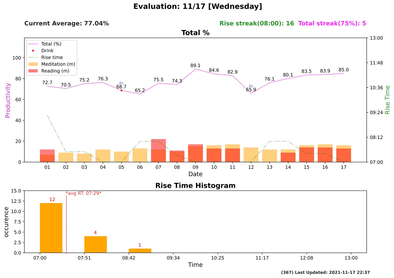
- Rise Streak & Total Streak: This feature was inspired by the "Snap streak" function in Snapchat. Snapchat implemented it to acquire and maintain more users. The streak feature is a psychological strategy that keeps the users coming back to continue their ongoing streak. Similarly, if the rise time continues to be lower than the listed time and the total percentage continues to be higher than the listed percentage, the number will increase by one each day. Also, the standard time & percentage will fluctuate depending on the past 30 days of data.
- This step is fully automated. Every time I turn on the laptop, and when the time hits 20:00, the Evaluation plot will automatically update as simulated below.