Notion: Data Collection
To collect daily data, I have made good use of a collaboration platform called Notion. It was a suitable fit for my project since it allowed extensive data accumulation. It also helped handle diverse datasets, make functions within the platform, and connect to Python using its REST API.
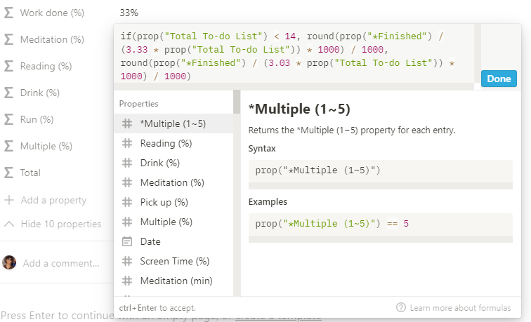
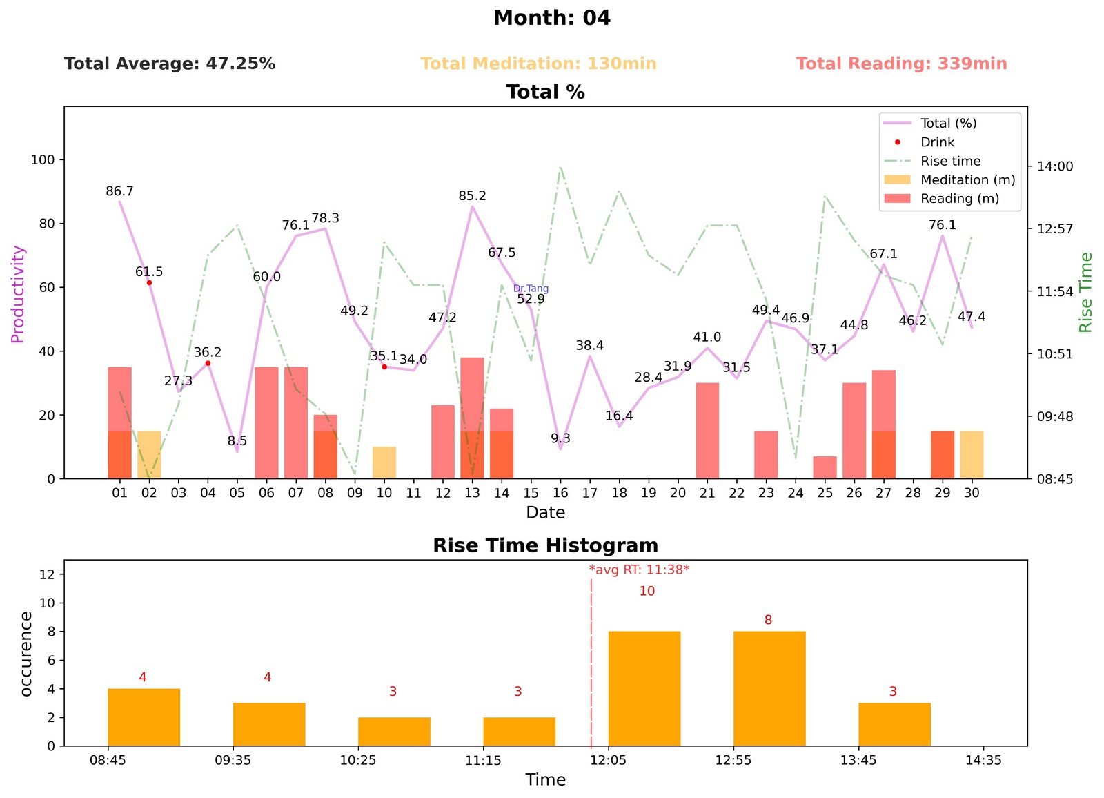
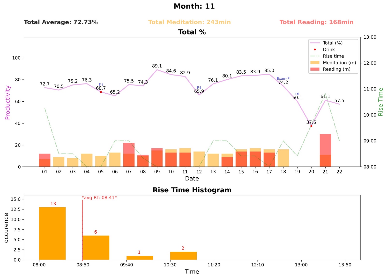
Every night, corresponding values are plugged into each variable, shown on the left. Once recorded, created functions instantly calculate them into intended ratios. Note that the values shown below are the "perfect" case scenario, where it represents the most productive and abundant day.
Data Sources & Explanation
Manaul Recording
Application Recording
Automated Recording
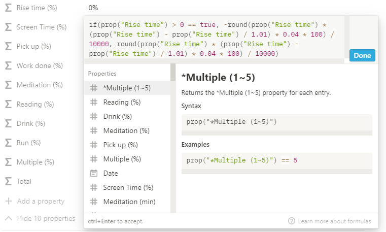
- Rise time: Time recorded when I got out of bed, where 0 indicates that I woke up on the intended rise time (usually 8 am). A negative value is inputted for rising earlier, and a positive value for waking up later than the intended time.
- Screen time & Phone pickups: The iPhone Screen time feature is used to record the values.
- Total To-do list & finished: To record the number of to-do lists, the Notion Scheduling database is used. (See Notion Automation page)
- Meditation (min): Meditation is done through an application called Balance. The total duration is usually 10, 15, or 20 minutes.
- Personal Reading (min): Reading duration is measured by simply timing the total minutes spent reading.
- Drink: If I feel 100% sober, then 0 is inputted, whereas if I feel the alcohol even a slightest, 1 is recorded.
- Books finished : 0 if I have not completed any book on a given day and 1 if I have.
- Run (km): Adidas application calculates the total distance ran in km.
- Star Metrics: These five different variables collaboratively depict the fullness of a given day. I believe these metrics are the best way to adequately represent a subjective view of the day-to-day rating. The average of these values is calculated and applied to compute the ratio on the right side.
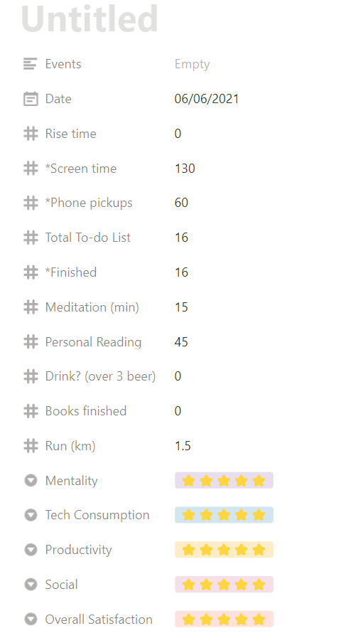
Input Variables
This image above illustrates different variables that impact my daily life. They were chosen through numerous experiments and lessons learned by reading books and enrolling in courses taught by world-class leaders. Hence, this table consists of 16 unique variables that are meaningful indicators that could represent the abundance of each day.
The variables include the time I woke up, minutes spent on my phone, total to-do lists completed, minutes spent meditating, and others. They are inputted every single day and currently have over 2 years worth of evaluations. Also, to prevent inconsistency, I have tried to minimize the "missed days" as much as possible.
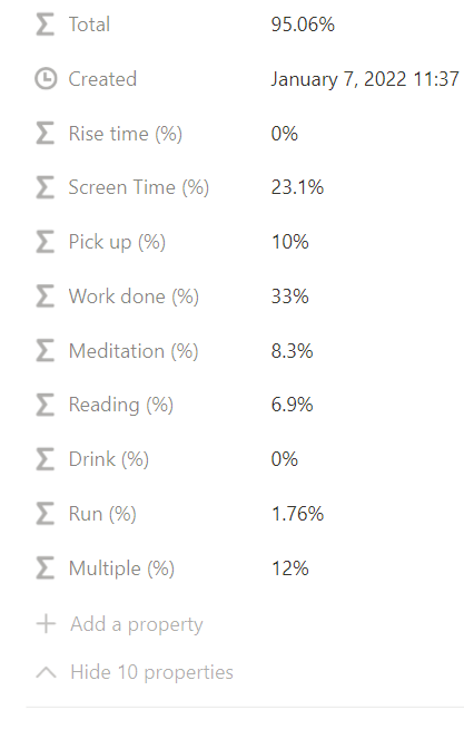
Output Variables (%)
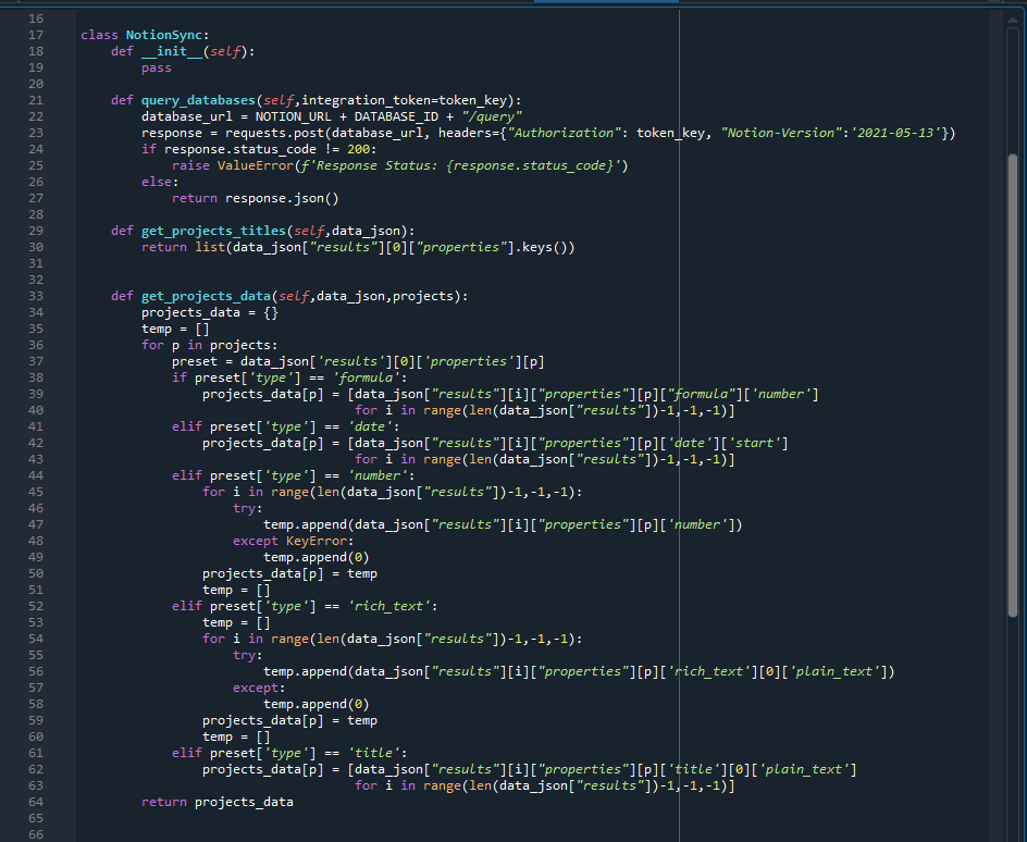
Depending on my preferred ratio and the numerical type of each variable, different Mathematical models are applied.
(Notion code example below)